Establishing a Perennial Visual Identity
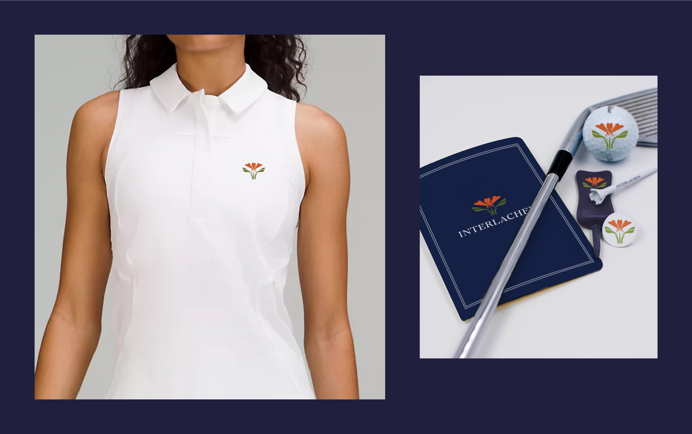
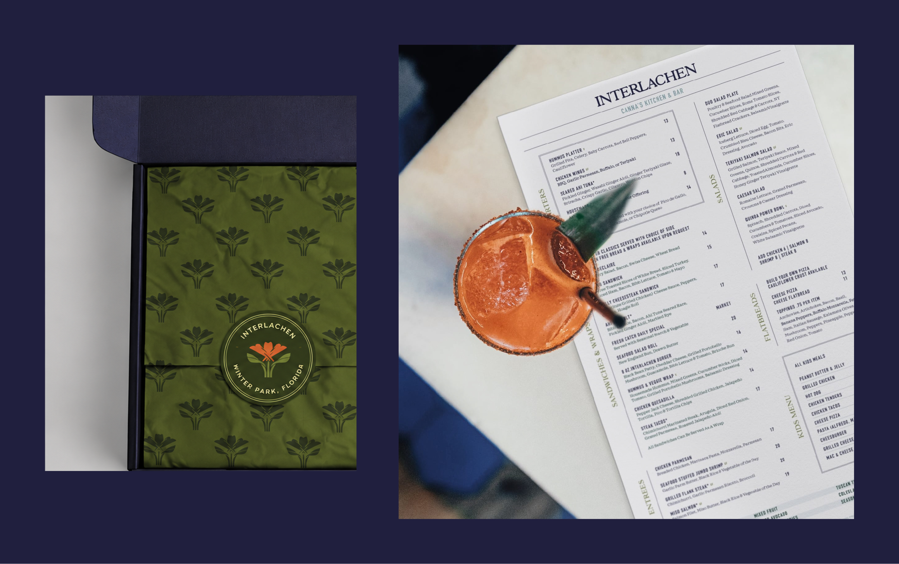
Findsome & Winmore rebranded Interlachen Country Club with a new logo and visual identity that spoke to the Club’s expanded amenities while honoring its heritage.
When they approached Findsome & Winmore, Interlachen Country Club had changed quite a bit since first welcoming a group of 50 founding members in 1983. Their 18-hole golf course –– once Interlachen’s sole amenity –– was now accompanied by tennis, aquatics, croquet, and numerous dining options. And the Club’s logo, a golfer in mid-swing, no longer spoke to the breadth of benefits members can enjoy.
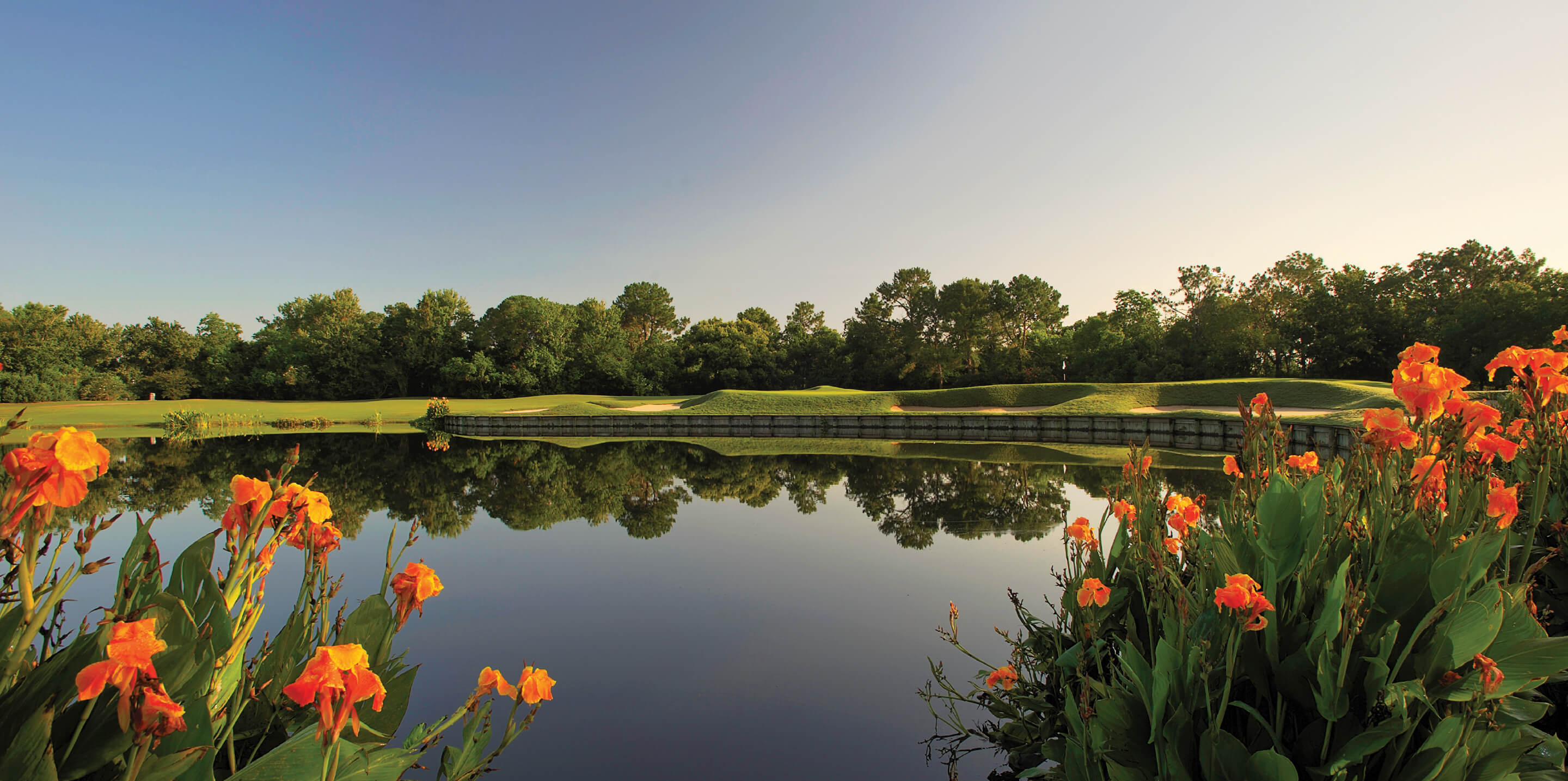
For their new logo and identity, we looked to Interlachen’s natural iconography: the symbols which tether the Club’s future to its earliest days. The canna lily logo is a tribute to the vibrant orange flowers which punctuate the grounds. And our accompanying brand colors –– a deep blue and a fairway green –– are borrowed from Interlachen’s many lakes and its flagship attraction, respectively. As Interlachen enters an exciting season of change, these perennial qualities act as fond reminders of where it all began.
Services
- Brand Identity
- Email Marketing
- Copywriting
- Brand Collateral
UNIQUE
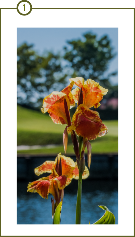
The new visuals draw inspiration from the Club’s distinctive canna lilies—the vibrant orange flowers which were planted at Interlachen decades ago.

ALL-ENCOMPASSING
In addition to the golf course, the amenities have grown to include tennis, aquatics, croquet and more. While the previous logo has served them well, we found it to be limiting in non-golf settings.

DISTINCTIVE
The previous logo has encountered brand confusion with other clubs, organizations, and retailers that feature a golf swing silhouette as the center of their respective logos. The canna lily is unmistakably Interlachen.